Poster- From New Moon to Eclipse!
Here´s an analysis about the poster evoulution from New Moon and Eclipse:
Special thanks to Nikki Law.

After a pretty exciting bout of eclipse posters being released, i begun comparing them with the new moon versions (obviously once i'd stopped staring at Edward's jaw line...) and found some pretty interesting differences. I think it's only obvious how very different these films are going to be when you can see them side by side.
So, taking the first comparison, between the two Cullen poster. In the new moon one, Bella is included, showing that she is a Cullen, or soon will be. Whereas in the eclipse poster, she's not present. I did think this was weird at first.. Edward is absent during the majority of new moon, so why would Bella be included as one of the family when they have left her? But then i considered that in new moon, there was no choice for Bella - it was always Edward. However in eclipse, she discovers that she loves Jacob too. However she is not featured in the wolf poster either. She was, however, featured in a poster alone. I don't know about you, but to me this symbolizes that she is going to have to make the choice alone, without Edward (or Jacob) by her side.
Another thing to notice was the coloring. New moon was so rich and vibrant to look at, whereas i think eclipse has gone back to the way twilight was - very, very blue.
Then, if we look at the placings of the Cullens, we can see that Carlisle and Esme are still far off in the distance - further away than they were in new moon. However Emmett has come forward, and Rosalie seems to have taken Alice's place as lead girl. The clothes are all simple but elegant, and all follow the blue theme, which makes them seem united. Throughout all the stills as well, they're all wearing different shades of blue.

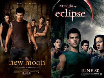
Ew, wolves. Really not my thing, if i'm honest. Except Paul. I like Paul. But anyway, i feel in some ways the eclipse poster has evolved more for the wolves than it has for the Cullens. It follows the same color scheme though (blue, with hints of green), and all the wolves show equal expressions. There has also been two editions to the eclipse poster - Leah, who has a very bold entrance, right at the front of the poster, and, if you squint, you can see Quil in the background. As everyone has been saying straight after this poster came out, WHERE IS SETH? You all have to remember though that one, Seth is thirteen, and not likely to be featured in a poster of basically grown men. Two, it's another person to fit into a poster that's already pretty full up. And three, Summit have to keep some things to themselves, and it seems they've chosen to hide Seth. Enjoy the anticipation! Don't, however, enjoy Jacob's shirt. Because it's gross.
As for Leah being at the front, i guess it's just to get some versatility into the poster. In they stuck her in the middle, i think it would look slightly strange, so they've chosen to put her at the side. Despite what many people have said, i really doubt it's because of her... female assets.

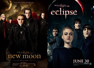
Now onto the Volturi. I love love LOVE the new moon poster, however i think the eclipse one is slightly predictable. I think it's again far too blue, as they're supposed the way black and grey, not navy, and i don't like the rain behind them.. lightning would be more appropriate in my eyes. To me, it just looks like they're in Seattle, like on the released clip. However i do like the expression, especially Jane's and i like that they are looking down on us, so i think the camera angle is very clever. We can see clearly that Aro, Caius and Marcus are not present in the eclipse poster, which is understandable, but a shame all the same.
{via TwiFans}
Special thanks to Nikki Law.

After a pretty exciting bout of eclipse posters being released, i begun comparing them with the new moon versions (obviously once i'd stopped staring at Edward's jaw line...) and found some pretty interesting differences. I think it's only obvious how very different these films are going to be when you can see them side by side.
So, taking the first comparison, between the two Cullen poster. In the new moon one, Bella is included, showing that she is a Cullen, or soon will be. Whereas in the eclipse poster, she's not present. I did think this was weird at first.. Edward is absent during the majority of new moon, so why would Bella be included as one of the family when they have left her? But then i considered that in new moon, there was no choice for Bella - it was always Edward. However in eclipse, she discovers that she loves Jacob too. However she is not featured in the wolf poster either. She was, however, featured in a poster alone. I don't know about you, but to me this symbolizes that she is going to have to make the choice alone, without Edward (or Jacob) by her side.
Another thing to notice was the coloring. New moon was so rich and vibrant to look at, whereas i think eclipse has gone back to the way twilight was - very, very blue.
Then, if we look at the placings of the Cullens, we can see that Carlisle and Esme are still far off in the distance - further away than they were in new moon. However Emmett has come forward, and Rosalie seems to have taken Alice's place as lead girl. The clothes are all simple but elegant, and all follow the blue theme, which makes them seem united. Throughout all the stills as well, they're all wearing different shades of blue.

Ew, wolves. Really not my thing, if i'm honest. Except Paul. I like Paul. But anyway, i feel in some ways the eclipse poster has evolved more for the wolves than it has for the Cullens. It follows the same color scheme though (blue, with hints of green), and all the wolves show equal expressions. There has also been two editions to the eclipse poster - Leah, who has a very bold entrance, right at the front of the poster, and, if you squint, you can see Quil in the background. As everyone has been saying straight after this poster came out, WHERE IS SETH? You all have to remember though that one, Seth is thirteen, and not likely to be featured in a poster of basically grown men. Two, it's another person to fit into a poster that's already pretty full up. And three, Summit have to keep some things to themselves, and it seems they've chosen to hide Seth. Enjoy the anticipation! Don't, however, enjoy Jacob's shirt. Because it's gross.
As for Leah being at the front, i guess it's just to get some versatility into the poster. In they stuck her in the middle, i think it would look slightly strange, so they've chosen to put her at the side. Despite what many people have said, i really doubt it's because of her... female assets.

Now onto the Volturi. I love love LOVE the new moon poster, however i think the eclipse one is slightly predictable. I think it's again far too blue, as they're supposed the way black and grey, not navy, and i don't like the rain behind them.. lightning would be more appropriate in my eyes. To me, it just looks like they're in Seattle, like on the released clip. However i do like the expression, especially Jane's and i like that they are looking down on us, so i think the camera angle is very clever. We can see clearly that Aro, Caius and Marcus are not present in the eclipse poster, which is understandable, but a shame all the same.
{via TwiFans}


